The SQL tab in the Spark Web UI has always had a query plan visualization. It shows you the physical plan as a DAG — operators as nodes, data flow as edges. In theory, it’s one of the most powerful debugging tools in Spark. In practice, it’s been nearly unusable for complex queries.
That changes now. SPARK-55785 reimagines the SQL plan visualization with compact layouts, interactive metric panels, and edge labels that surface data flow at a glance.
The Problem
The old visualization crammed every metric into every node label:
HashAggregate
number of output rows: total (min, med, max)
  5,000,000 (1,250,000, 1,250,000, 1,250,000)
time in aggregation build: total (min, med, max)
  2.3s (500ms, 575ms, 650ms)
peak memory: total (min, med, max)
  512.0 MiB (128.0 MiB, 128.0 MiB, 128.0 MiB)
avg hash probe bucket list iters: ...
  1.2 (1.1, 1.2, 1.3)
Multiply that by 30+ operators in a real-world query, and you get a wall of text where nothing stands out. The most critical information — which operator is slow? where do rows explode? where does the data get filtered down? — is buried in visual noise.
The Solution
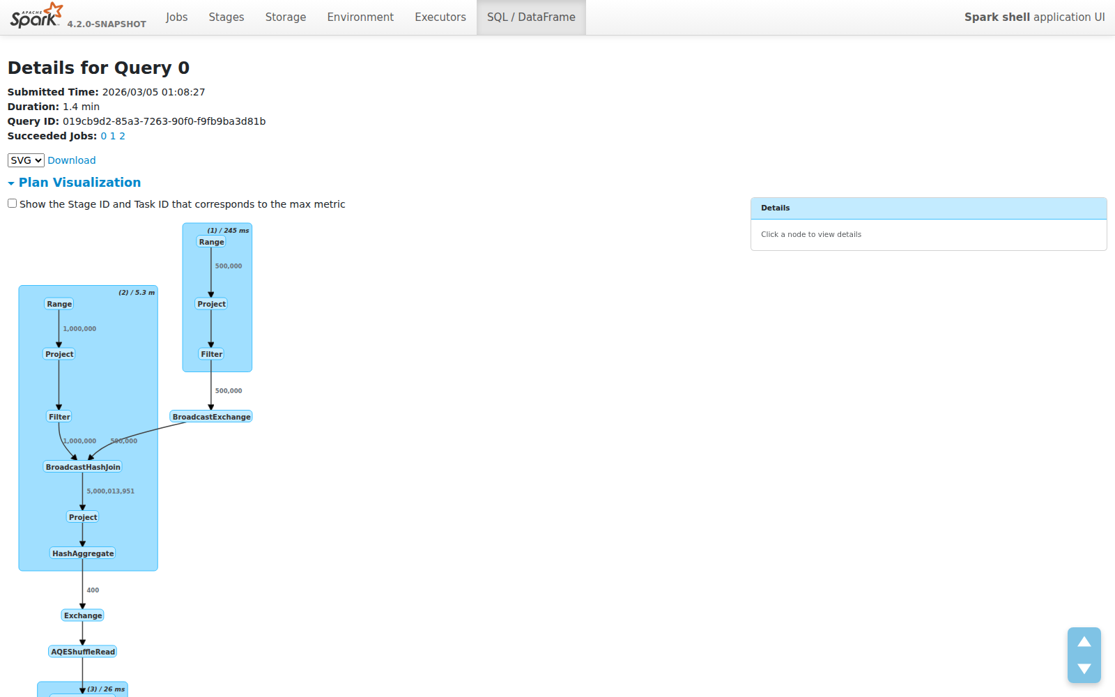
Compact Mode: See the Forest, Not the Trees
The new default view shows operator names only. No metrics clutter. The plan structure is immediately readable:
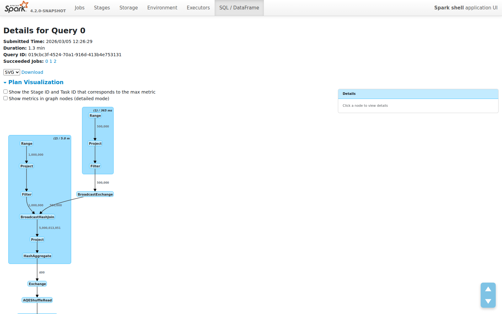
Each node is just its operator name. Each cluster shows the WholeStageCodegen stage number and total duration. The plan fits on one screen instead of requiring endless scrolling.
Edge Labels: Data Flow at a Glance
The most impactful addition isn’t in the nodes — it’s on the edges. Row counts now appear on every edge, showing exactly how much data flows between operators:
This makes several classes of performance problems immediately visible:
- Join explosions — 1M × 500K inputs producing 5B rows? You’ll see it instantly on the edge label.
- Filter effectiveness — Does your filter reduce 5B rows to 400? The edge tells you without clicking anything.
- Aggregation impact — See exactly how much your GROUP BY compresses the dataset.
These are the questions engineers ask first when debugging slow queries. Previously, you had to mentally trace through metric tables or use EXPLAIN output. Now the answer is right there on the graph.
Click for Details: Metric Side Panel
Need the full picture? Click any node. A side panel slides in with structured metric tables:
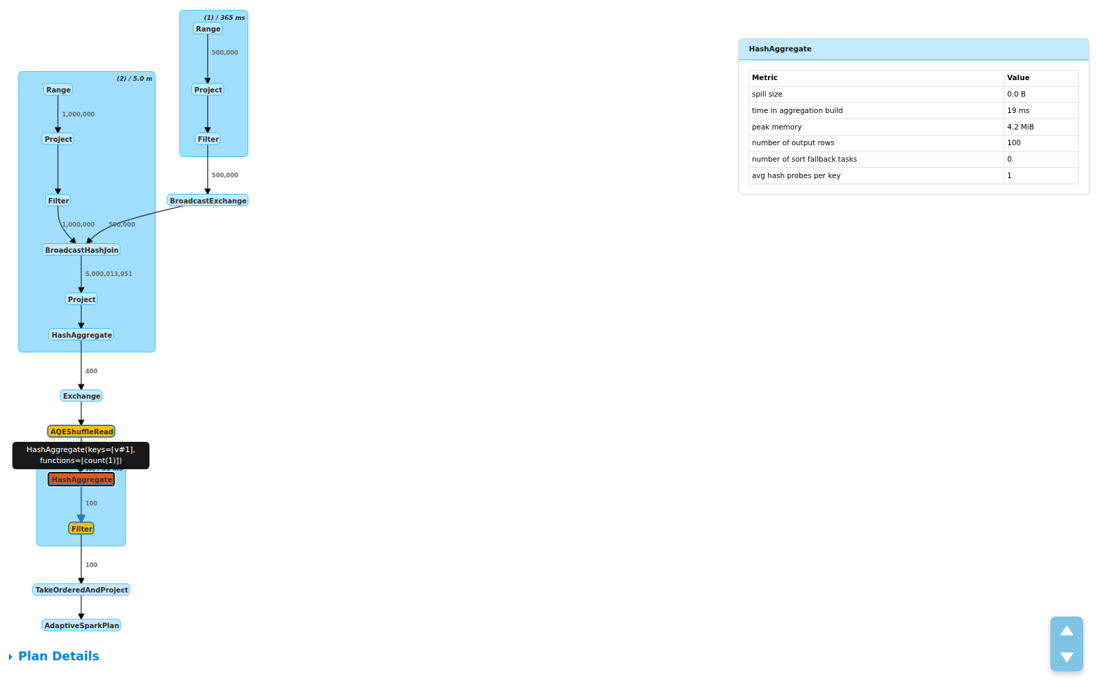
The panel shows:
- Total / Min / Med / Max breakdowns per metric
- Operator description on hover for disambiguation (useful when you have multiple
HashAggregatenodes) - Cluster click to see all child operator metrics grouped together
This design was inspired by Databricks’ query profiler, adapted for the open source Spark UI.
Toggle: Your Choice
Prefer the old detailed view? A checkbox lets you switch between compact and detailed modes. In detailed mode, metrics are rendered inside the graph nodes (at 10px font to keep things readable):
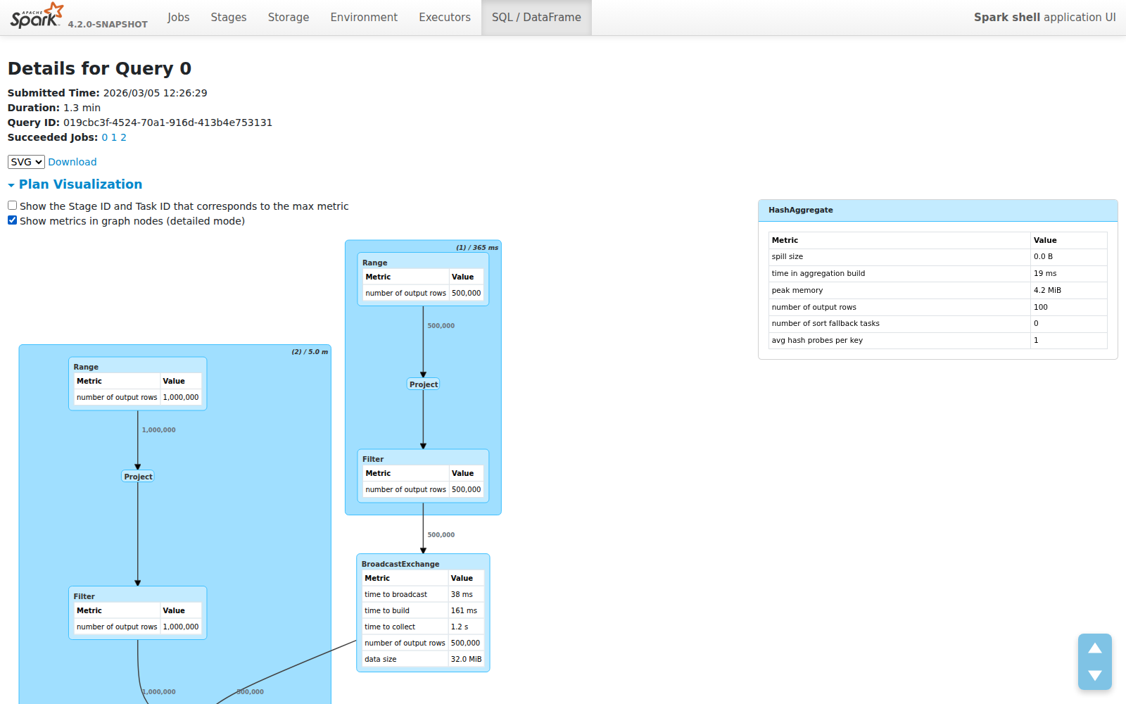
Your preference is saved in localStorage — the UI remembers how you like it.
Design Decisions
A few choices worth calling out:
Why edge labels over node metrics? Because the most important performance signal is data volume between operators, not the internals of a single operator. Edge labels answer “what happened to my data?” at the plan level. Node metrics answer “why is this specific operator slow?” — and those belong in the detail panel, not the overview.
Why plain text labels instead of HTML? The old visualization used dagre-d3’s labelType: "html" for rich formatting inside nodes. This caused rendering inconsistencies, made dark mode support harder, and produced oversized nodes. Plain text labels are lighter, more predictable, and let dagre-d3 auto-size nodes correctly.
Why a side panel instead of tooltips? Metric tables can be large — 6+ metrics with Total/Min/Med/Max columns. Tooltips would clip or overlap. A fixed side panel provides stable, scrollable space and doesn’t obscure the graph.
What’s Next
This is part of the broader Spark Web UI Modernization effort. Future improvements under discussion include:
- Showing data flow paths for a single selected operator
- Highlighting bottleneck operators by color (time/rows heatmaps)
- Edge annotations for data size in bytes, not just row counts
This feature was contributed as SPARK-55785 (PR #54565). Thanks to @sarutak and @gengliangwang for the review and the suggestion that led to edge row count labels.